← BlogProduct Releases
Time Machine Comes to the Live Map: Rewind Any Tracker Without Losing Your Place
TJ Chasteen
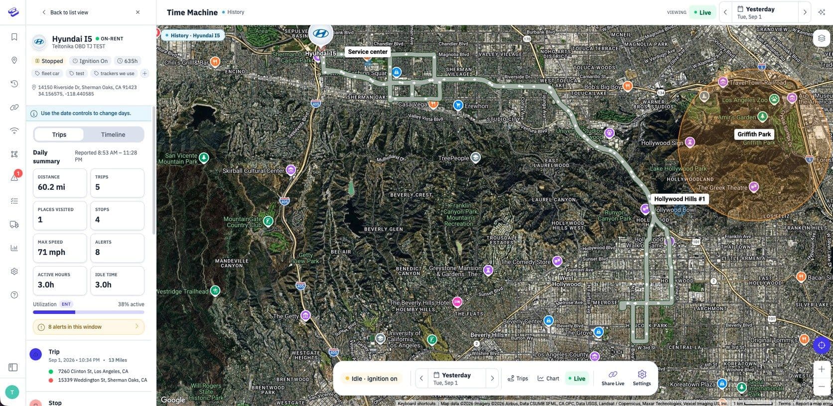
Time Machine has always been one of the most useful things in Hapn — and one of the easiest to forget about. It lived on its own screen. Getting there meant leaving the live map, finding your tracker again in a plain dropdown, and rebuilding the context you already had. That is a lot of friction for a question as simple as “where was this an hour ago?”
So we moved it. Time Machine now runs on the live map, on the tracker you are already following. One click back and you are looking at yesterday — same tracker, same map, same place on the screen.
Step Back Without Leaving the Map
When you are following a tracker, a date control sits in the header and a matching one sits in the floating bar over the map. The two stay in sync, so changing one changes the other. Press the back arrow and you drop into a Time Machine session right where you are: the map switches to that day’s route, the trip list fills in, and the tracker card you were already reading stays put at the top of the rail. No dropdown, no reselecting, no reorienting.
Click the date itself and you can pick a range instead of a single day — today, yesterday, the last 24 hours, the last 7 or 30 days, or a custom window. A Live button walks you back to the present whenever you want it.
The Whole Day at a Glance
Pick a past day and the left rail opens with a summary of it: distance driven, trips, places visited, stops, max speed and alerts. No adding trips up by hand, and no exporting a report to answer a question that should take five seconds.
Enterprise plans also see active hours, idle time and a utilization bar for that day, so “was this asset actually working?” becomes a glance instead of an investigation.
Replay Any Trip
Select a trip and the floating bar turns into a set of transport controls. The route highlights on the map and a marker drives it, start to finish. Play, pause, drag the scrubber to any moment, or speed the playback up when you just want to see where it ended up.
The Full Story of a Single Trip
Selecting a trip also swaps the rail to a detailed view of it: where it started and ended, when, how long it took, and whether anything went wrong along the way. Below that sits a connected timeline of the trip — started, each stop, any alerts such as speeding, ended — with addresses attached, plus stat cards covering distance, speed and driving habits.
Stops behave sensibly too. Clicking one highlights it on the map without dragging you into a playback you did not ask for.
Watch a Metric Across the Day
Some questions are not about a route at all. The Chart action opens a full-width strip along the top of the map and plots a single metric across the day you have selected — battery for battery-powered trackers, fuel for OBD devices, and idle time or utilization for hardwired assets on Enterprise plans. It is the fastest way to spot a drain pattern, a fuel drop, or a day where an asset barely moved.
The Classic Time Machine Is Still There
Nothing is going away today. The standalone Time Machine screen still works exactly as it always has, and any links or bookmarks pointing at it are fine. We are running both side by side for a while so you can move over at your own pace. Try the new one on a tracker you look at often — that is where the difference shows up fastest.
This is live now in the Hapn web dashboard. Follow any tracker on the live map and press the back arrow next to the date. As always, we built this because customers told us history was too hard to get to — if there is something you still cannot get at easily, get in touch and tell us.
Explore Hapn on a live equipment fleet
Click around the real platform — a live mixed fleet with dummy data. No sales call, takes a few minutes.
Volume discounts • No 3-year contracts • Quote in ~24 hours



Get the latest news straight to your inbox.
Share Article
